Friday, 9 March 2012
Question 5
]
Whilst planning my magazine I decided to use simple font with large writing that young readers would find appealing and interesting. The styling of my magazine appeals to a young audience because it shows large clear images of people who clearly represent the rock genre, readers will quickly be able to identify what style my magazine, by the title alone “Just rock” so straight away they would be attracted to it. The article titles on my magazine are stand out and appealing, having a title to attract people in then a little bit of text to explain to the readers what to expect from the article. From the video interviews I conducted it can see that my readers agree with what I set out to do throughout my magazine.
Question 4 benefited me greatly, as I was able to determine what exactly I was going to put in my magazine and what my target audience was going to be looking for and interested in. I was also helped by a questionnaire I created early on my production process, I was able to use the results of that to determine even more accurately what people were interested, and how many of them had interests in them. I have several bar charts with information regarding my results of the questionnaire.
These are my results from the questionnair, they can also be found later on in my blog. I thought it was important to inclue these here as it shows how i determined exactly what my magazine would be like.
Thursday, 8 March 2012
Codes and Conventions Media
Cover: C
- One Main image
- Color scheme
- Cover lines (lines of text)
- Main cover line (Largest title)
- Small headers (Right side)
- Buzz words
- Barcodes (bottom)
- Title is usually partly covered by image (well known brands dont need showing)
- Page is full with info
- Unique font
- Splashs
- Strip across top or bottom
- Directe mode of adress
- Studio photographs
- Price, issue, date and title.
- Esclusive interviews with bands
- Many big pictures
- Color scheme (same simple colors used in cover)
- Date
- Issue number
- Features
- Advertisments
- Less direct (People in the pictures are looking away)
- Page numbers for contents
- Main content
- Side content
- Prizes
- Collumss (3/4)
- Written if conventional way
- Bold tpye
- Sublines (More details, small font)
- One main image
- Quotes/interviews
- Range of photo tpyes
- Page title name (Contents)
- Magazine name (Kerrang)
Wednesday, 7 March 2012
Tuesday, 6 March 2012
Monday, 5 March 2012
Friday, 2 March 2012
Evaluation of College Magazine
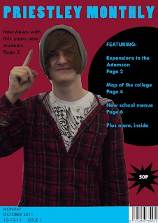
After studying several magazines I was able to create a list of codes and conventions of a modern day magazine, whilst making my magazine I was able to use this list to follow the ‘rules’ magazines generally follow to create a more realistic looking magazine cover and contents page. I added a main central image, a bar code, along with price and dates and a featuring column, mentioning things within the magazine. All of these are generally part of the real magazines Codes and Conventions. I also used a colour scheme of light blue, dark red and black on both the magazine and the contents page, just as magazines do. The colour scheme helps people recognise the magazine from a distance, just by the colours used on the front cover.
Whilst making the magazine, I used two programs. One called Photoshop, the other called Quarkxpress. The program Photoshop helped me manipulate and edit original images I had taken myself, I was able to resize it and remove the background of the main image (Sean) These images were used on the front cover of my magazine. I was then able to add my dark red background behind the picture. I also added a light blue title to my magazine (Priestley Monthly) along with adding black text to advertise what is within the magazine. I also used the programme Quark to make the contents page, I was then able to add text boxes, text and images, still following the colour scheme used on the cover. Both of these programs were new to me, it took a while to get used to because they are very complicated, but they was able to help me make a good looking magazine cover in a short space of time.
Overall I am generally happy with my finished product, as it’s the first time I have used either Quarkxpress or Photoshop, I learnt new techniques and methods whilst using them that will benefit me when I come to make more. With the things I learnt I feel confident that next time I am asked to create some thing, I will be able to make something of even better quality than what I produced this time. I believe I managed follow the codes and conventions of a professional, real life magazine well using most of the things I noted down whilst studying the magazine. However, in comparison to the professional magazine covers I was unable to create a professional looking cover. My main image was poorly cropped because once again I had never used this tool before. My colour scheme worked well, because the contents page actually looked like it would belong with my main cover.
Thursday, 1 March 2012
Initial ideas
I have chosen to do a rock magazine featuring music from all kinds of bands, both modern and classics from the 80's and 90's. It will appeal to a target audience of 16-25 years of age, so long as they have an interest in rock music. The magazine will be mature, and informal so it might not be suitable for people under the age of 16. The modern rock and informal attitude of the magazine would only suit upto 35 year olds.
Subscribe to:
Comments (Atom)


